David Portfolio Logo

BLOG

UNIVARIATE VISUALIZATION

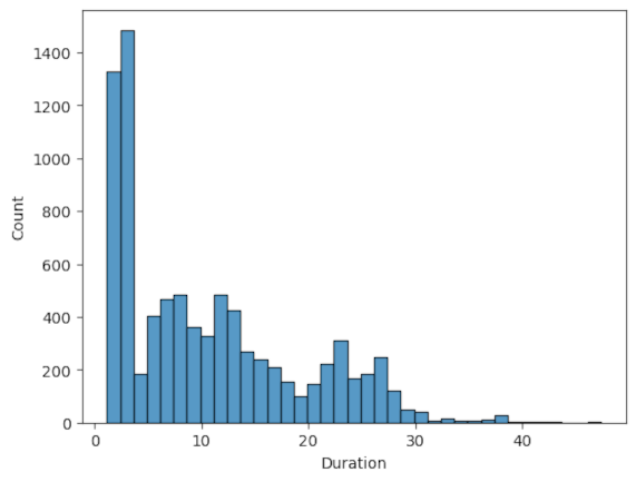
Making decisions based on data is a key in any field. Understanding of data is the priority of data analyst. One of the simplest and most effective methods for preliminary data exploration are univariate visualizations, which focuses on a single variable. In this blog, we will explore univariate visualizations including their definition, significance, and applications for revealing the obscurities within the data.

What is Univariate Visualization?

Univariate visualizations are graphical representations of data that focus on one variable at a time. Without considering numerous variables, it enables a clear and concise view of data distribution and patterns.

Situations for Implementing Univariate Visualizations

Univariate visualizations are particularly beneficial for:

  • Gaining a rapid understanding of the distribution and features of individual variables.
  • Delivering clear insights to stakeholders who might not grasp complex statistical techniques.
  • Data preprocessing by spotting outliers or anomalies that may require further scrutiny.

Univariate visualizations serve as an initial step in understanding the narrative behind the data. Mastering these straightforward yet impactful tools establishes a foundation for more intricate data analysis and visualization.

  • Keep it simple, avoid unnecessary complexity.
  • Label all elements & data points.
  • Use color to enhance readability & clarity.
  • Provide meaningful data context.
  • Histograms

    Best suited for displaying the distribution of continuous variables.

  • Box Plots

    Effective for emphasizing the median, quartiles, and possible outliers in a dataset.

  • Bar Charts

    Ideal for representing categorical data, illustrating the count or frequency of each category.

  • Pie Charts

    Helpful for showing proportions within a dataset, best used with a minimum of five categorical variables.

BIVARIATE VISUALIZATION

In data analysis, visualizations are essential for translating raw data into meaningful insights. Bivariate visualizations, which involve two variables, allow analysts to investigate and represent relationships, patterns, or correlations. Unlike univariate visualizations that explore a single variable, bivariate techniques reveal how two variables interact, providing a richer understanding of the dataset. This guide explores common types of bivariate visualizations, their applications, and best practices to create compelling and informative visual representations.

What is Bivariate Visualization?

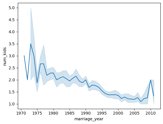
This is the graphical representation of two variables on a chart. The analysts visually interpret relationships between variables, making it easier to spot trends, correlations, and outliers that may not be evident in tabular data alone. It also helps determine if two variables increase together, vary inversely, or show no correlation at all, aiding in decision-making, hypothesis testing, and predictive modeling.

Types of Bivariate Visualizations

1. Scatter Plots

  • Scatter plots display individual data points on a two-dimensional x-y axis, where each point corresponds to the values of two different variables.
  • Useful for identifying correlations, trends, or outliers within datasets where both variables are numerical

2. Line Charts

  • A sequence of data points are joined with lines, usually to show changes over time or across a continuous variable.
  • Suited for for time-series data or any variable observed over continuous intervals for instance monthly sales over a year to identify patterns over time.

3. Heatmaps

  • Utilize a gradient of colors in a matrix form to illustrate values, with the intensity of the color indicating the strength or density of the data points.
  • Great for displaying the intensity of correlations or density in data points across two categorical or continuous variables.

4. Bubble Charts

  • Incorporate an additional dimension into the scatter plots through the size of the bubbles, which enables the visualization of a third variable.
  • Useful analyzing three variables, typically to emphasize categorical data within a pair of continuous variables.

5. Box Plots

  • Provide a summary of data distribution through a five-number summary, which includes the minimum, first quartile, median, third quartile, and maximum.
  • Compare the distributions between two groups and identifying outliers.

MULTIVARIATE VISUALIZATION

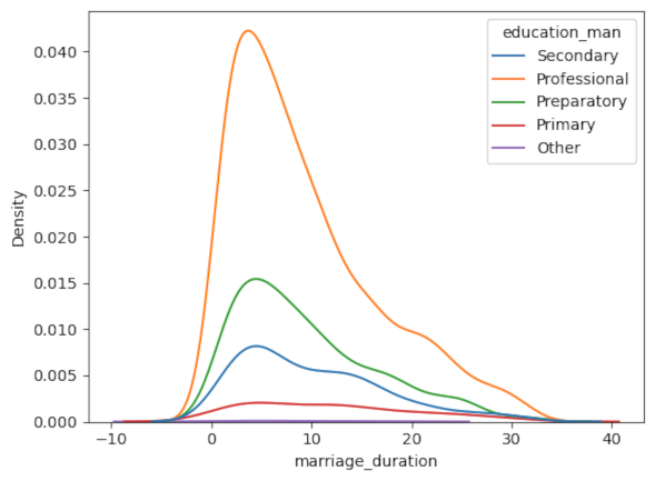
In data analysis, showcasing how multiple variables relate to each other can reveal insights that are otherwise difficult to see. Contrary to univariate and bivariate visualizations that only examine one and two variables respectively, multivariate techniques allow us to see how multiple variables interact, providing a a more comprehensive understanding of complex datasets. The blog discusses other multivariate visualizations apart from Bubble Charts, Heatmaps and Scatter plots, and also provide a practical scenarios of applications.

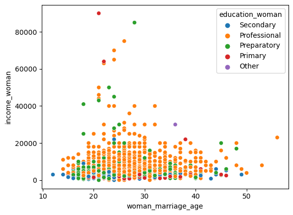
Multivariate Visualization involves graphically representing more than two variables at the same time. The method is crucial for uncovering complex patterns, relationships, and trends that might not be visible through univariate or bivariate analysis. For data analysts, these visualizations assist in spotting clusters, correlations, and possible causal links that contribute to insights and decision-making.

Types of Bivariate Visualizations

1. 3D Scatter Plots

  • A scatter plot in three dimensions, where points are plotted based on three different variables.
  • Ideal when two-dimensional plots don't capture the full story, visualize relationships in three-dimensional space.

2. Treemaps

  • Hierarchical charts that use nested rectangles to represent data proportions. Each size of the rectangle represents a part of the whole.
  • Useful for visualizing hierarchical data and part-to-whole relationships for instance market share within an industry.

3. Radar or Spider Charts

  • Displays multiple variables on axes arranged radially from a common center, forming a shape for each data observation.
  • Useful for analyzing several variables across various entities, offering a quick overview of performance in multiple dimensions for instance comparing athletes on skills like speed, strength, and agility.

4. Violin Plots

  • Violin plots resemble box plots, but they display the density distribution of the data. The plots offer a deeper understanding of the shape, spread, and variability of data across different categories.
  • Useful for comparing distributions between groups when you want to know both measures of central tendency and distribution.

5. Facet Grids

  • Multivariate data is divided into smaller, individual visualizations that correspond to particular categories. Every chart within the grid displays the same variables but focuses on different data subsets.
  • Useful when comparing distributions or trends across multiple categories.

Multivariate visualizations empower data analysts to reveal complex relationships within data that would remain hidden in simpler evaluations. These types of multivariate visualizations enable analysts to customize the visualization approach based on the characteristics of the data, enhancing the insights gained from complex datasets. By choosing suitable visualization types and adhering to best practices, analyst can develop effective visual representations that facilitate data-driven decision-making and clerly convey insights.

VISUAL SUMMARY

  • Histogram sns.histplot()
  • Box Plot sns.boxplot()
  • Density Plot sns.kdeplot()
  • Violin Plot sns.violinplot()
  • Bar Chart sns.barplot()
  • Pie Chart plt.pie()
  • Dot Plot plt.scatter()
  • Stem-and-Leaf Plot plt.stem()
  • Scatter Plot sns.scatterplot()
  • Line Chart plt.plot()
  • Heatmap sns.heatmap()
  • Bubble Chart plt.scatter()
  • Stacked or Grouped Bar Chart plt.bar()
  • Hexbin Plot plt.hexbin() or sns.jointplot()
  • 2D Density Plot sns.kdeplot()
  • Side-by-side Box Plot & Violin Plot sns.boxplot() & sns.violinplot() with hue
  • Pair Plot sns.pairplot()
  • 3D Scatter Plot Axes3D.scatter() from mpl_toolkits.mplot3d
  • Clustered Bar Chart sns.catplot(kind="bar")
  • Treemap squarify.plot() from squarify
  • Radar Chart plt.plot()
  • Facet Grid sns.FacetGrid()
  • Mosaic Plot mosaic() from statsmodels.graphics.mosaicplot
Get in Touch

Contact